
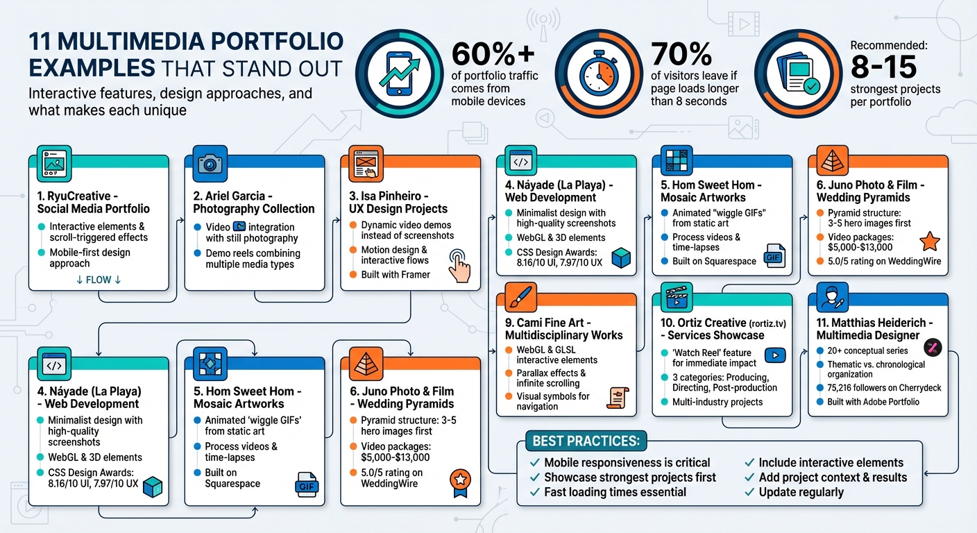
11 Examples of Multimedia Portfolios
Portfolios have transformed from static collections into dynamic, interactive experiences. This article showcases 11 multimedia portfolios that integrate video, animation, and interactivity to engage viewers and demonstrate skills effectively. These portfolios highlight how professionals across various fields, such as UX design, photography, and digital art, present their work in visually engaging ways.
Key takeaways:
- Interactive Features: Many portfolios use videos, animations, and scroll-triggered effects to showcase work.
- Mobile Optimization: With over 60% of portfolio traffic coming from mobile devices, responsive design is critical.
- Storytelling: Portfolios often include project context, personal narratives, or behind-the-scenes content to build deeper connections with viewers.
Whether you're a designer, artist, or videographer, these examples demonstrate how to create a portfolio that stands out and leaves a lasting impression.
11 Multimedia Portfolio Examples: Interactive Features and Design Approaches
8 Portfolio Websites the felt Unreal
sbb-itb-6487feb
1. RyuCreative's Social Elevation Portfolio
Ryan Mort's social portfolio reimagines the classic gallery format by turning it into a dynamic multimedia experience. It showcases graphics crafted to captivate audiences and amplify brand presence, emphasizing the power of visual storytelling.
The portfolio blends traditional desktop design tools with mobile-first apps to produce content tailored specifically for social media platforms. Instead of static thumbnail grids, it introduces interactive elements that elevate user engagement.
This fresh approach sets a benchmark for portfolios that push the boundaries of multimedia presentation.
2. Ariel Garcia's Photography Collection
Ariel Garcia's portfolio goes beyond traditional photo galleries, turning them into dynamic experiences by incorporating video and interactive features. By combining photography with elements like cinematography, editing, and motion graphics, Garcia creates visually compelling stories that captivate audiences.
One standout example is his demo reel, which seamlessly integrates still photography with video elements. This showcases his ability to merge video production, design, web development, and photography into a unified and engaging narrative. This distinctive approach redefines what a multimedia portfolio can achieve.
3. Isa Pinheiro's UX Design Projects
Isa Pinheiro, a multidisciplinary designer and illustrator based in Singapore, has crafted an engaging UX portfolio that stands out for its use of dynamic video demos, motion design, and interactivity. Instead of relying on static screenshots, she opts for videos to demonstrate design flows, providing visitors with a clear sense of how her creations function. Michael Wong, Founder of Designership, highlights this approach:
"She also presented her works in a strong manner because she utilized videos to give her visitors an actual experience of how she does things."
This approach is especially evident in her project "Foody."
The "Foody" app features a Cooking Mode that replaces traditional, text-heavy instructions with short, step-by-step video guides. As Pinheiro explains:
"Cooking Mode helps you follow along while you're cooking. Each step has its own short video and allows you to follow along without the need to read."
The app also integrates Apple Watch notifications and timers, making it easy for users to follow instructions hands-free.
Another standout project, "Gameshelf", addresses the challenge of managing both digital and physical game collections. Pinheiro shares the inspiration behind it:
"Gameshelf was born from my personal struggle to keep all my digital and physical games in one place."
The app includes a camera-based scanner for quickly adding physical games and an automated syncing system that updates libraries by connecting with gaming profiles.
Pinheiro’s work also extends into augmented reality with projects like Jadu AR, designed for spatial gaming, and Future-X by SK-II, which reimagines beauty retail experiences. Her portfolio, created using Framer, features motion experiments showcased on Dribbble, such as the "Shophouse Food Guide" and the "Discover" motion study. Her design philosophy ties all her work together:
"I help simplify complex problems and transform them into intuitive interfaces."
4. Náyade's Web Development Screenshots
Náyade, a web designer and front-end developer working under the portfolio name "La Playa" from Lanzarote, has mastered the art of creating a minimalist yet impactful multimedia portfolio. Each project in her portfolio is presented with a high-quality screenshot, the client’s name, and a brief description of her role - whether it involved design, development, or logo creation. Clicking on any portfolio item takes users directly to the live website, offering a seamless way to explore her work firsthand.
Her technical expertise shines through in her projects. For instance, her Naya Studio project received impressive scores from the CSS Design Awards: 8.16/10 for UI and 7.97/10 for UX and Innovation. Salva Carlino also rated her work highly, giving it 9/10 in all three categories - UI, UX, and Innovation. These accolades reflect her skillful use of WebGL, 3D elements, and what she calls "crafted motion" to create immersive user experiences. This combination of technical know-how and artistic precision demonstrates how multimedia can enhance a portfolio's appeal.
Náyade’s versatility is evident in her wide-ranging project experience. With 19 years of expertise and a background in Computer Science Engineering, she brings both technical and artistic strengths to her work. This is clear in projects she’s completed for One Element, Talaria, and Très Difficile. She sums up her approach to design by saying:
"I solve operational and functional problems through design and a good strategy", explains Nayara de La Hoz, UX/UI Designer.
Her portfolio also includes creative, personality-driven features that make it stand out. For example, it incorporates a real-time GPS tracker showing her current location and live Lanzarote weather updates. These dynamic elements add a touch of interactivity to the otherwise minimalist design, making the portfolio both functional and engaging.
5. Hom Sweet Hom's Mosaic Artworks
Lauren Hom's Hom Sweet Hom portfolio transforms the traditional grid into a lively mosaic, showcasing a variety of projects like hand-lettering, murals, food art, and photography. Each project comes to life with hover-over details, giving users an interactive experience.
One standout feature of her portfolio is how it animates static artwork. Using Photoshop, Hom crafts "wiggle GIFs" that turn her illustrations into dynamic, vibrating animations. This approach not only enhances her work but also boosts engagement on platforms like Instagram. Her "Fauxsaics" series - a collection of typographic mosaic illustrations - earned widespread recognition and was highlighted by design platforms like Designboom, My Modern Met, and Abduzeedo. These dynamic visuals naturally transition into other multimedia elements featured across her portfolio.
The portfolio also includes process videos and time-lapse recordings, offering a behind-the-scenes look at her projects from concept to completion. Hom adds depth to her digital lettering by using 3D techniques in Procreate, creating a tactile and dimensional effect. A notable example of her larger-scale work is the 12-by-16-foot Googleplex Mural for Google, which features the phrase "We're going places" and showcases her ability to deliver impactful commercial art.
Hom's portfolio goes beyond showcasing her creations - it also serves as a learning hub. Her Creative Resource Library offers video tutorials, downloadable worksheets, and interactive PDF guides, blending her roles as an artist and educator. One of her most inventive projects, "Will Letter for Lunch", highlights her knack for creative problem-solving. In this initiative, she traded hand-lettered menus for meals at over 30 New York City restaurants in just one year. As Hom herself puts it:
"Passion projects are the secret ingredient to building a business as an artist".
Built on Squarespace, her portfolio demonstrates how even standard website builders can be customized for high-end creative presentations. Having shared her multimedia strategies at over 50 events worldwide, Hom exemplifies how combining diverse passions - like lettering and culinary arts - can carve out a distinct niche in the creative market.
6. Juno Photo & Film's Wedding Pyramids
Juno Photo & Film's portfolio uses a pyramid structure to organize its multimedia content in a visually engaging way. It starts with three to five hero images that set the tone and mood, followed by the full collection for those wanting a deeper dive. This layered design keeps things clean and approachable while putting the studio’s standout work front and center. Instead of overwhelming visitors, it creates a dynamic experience that feels both curated and easy to navigate. This structure also transitions seamlessly into their video offerings.
The portfolio balances varied video formats alongside photography, giving couples plenty of options. Choices include Highlight Films (5 minutes), Short Films (8–10 minutes), and Feature Films (15–20+ minutes), with prices ranging from $5,000 to $13,000 depending on factors like location and film length. Filmmaker Daniel describes his style as minimal and unobtrusive:
"My approach is unobtrusive - one camera, one lens, moving with precision to let the day unfold naturally".
This minimalist approach shapes the studio's aesthetic, featuring muted tones and ample negative space, ensuring the focus stays on the content itself.
Lead photographer Julia C. Vona brings a wealth of experience, drawing from 18 years in fashion and documentary storytelling to shape the studio's visual identity. The portfolio also incorporates hybrid film formats, blending digital photography with 35mm and medium format film for a nostalgic, textured feel. To elevate the cinematic quality, drone footage is also part of their toolkit.
The studio's reputation is further strengthened by its professional accolades, with features in Vogue, Tatler, and Style Me Pretty adding credibility. Juno Wedding Films boasts a 5.0/5 rating on WeddingWire based on 35 reviews and is ranked among the "Top 10 Wedding Videographers in the UK". Clients receive photo previews within 48 hours, while full galleries are delivered in 4–5 weeks.
One standout feature is their 10-year storage guarantee for all wedding footage, giving couples the flexibility to upgrade their film packages even years after their wedding. This long-term commitment highlights the studio's focus not only on artistic quality but also on exceptional client service, showing how portfolios can effectively convey both creativity and reliability.
7. All The Bins Music Curation
All The Bins turns music curation into a visually engaging portfolio, treating playlists as works of art. Using the Format platform, it showcases playlists in an album-focused grid layout, making browsing feel more like wandering through an art exhibit than scrolling through a typical playlist. The tagline, "music worth listening to," sets the tone, positioning the curator as a tastemaker and highlighting curation as a creative process.
What sets this portfolio apart is its mood-based navigation system. Instead of categorizing playlists by genres, it uses descriptive moods like "ethereal, radiant, airy" or "nostalgic, vintage, warm" for its 26+ playlists. For instance, the "Absynthe Minded" playlist, featuring artists such as Francis And The Lights, Fakear, and SZA, carries tags like "expansive" and "reflective." Meanwhile, the "Stetson Thunder" playlist captures "authentic, twangy, pensive, yearning" vibes with tracks from Miranda Lambert and Midland.
To keep users engaged, embedded Spotify players allow seamless track previews without leaving the site. There's also a "Sampler" playlist that brings together top tracks from 20 different collections, offering a diverse mix of indie folk, hip-hop, jazz, Afrobeats, and bossa nova.
Adding a personal touch, the "Field Notes" section blends storytelling with curation. One entry shares a memory of listening to Daft Punk while visiting a creative loft in Cincinnati, turning the portfolio into a visual and narrative diary. These anecdotes create a deeper connection, combining technical curation with personal experiences to enrich the overall experience.
8. Sam Spratt's Digital Paintings Series
Sam Spratt blends the richness of classical oil painting techniques with the capabilities of digital tools to craft a portfolio that feels both timeless and modern. His LUCI series stands out as a prime example - an episodic collection of digital paintings paired with written psalms, designed to unfold like chapters in a novel. This series showcases Spratt's ability to merge the tactile essence of traditional art with the speed and flexibility of digital creation.
Spratt's creativity doesn't stop at static pieces. He integrates interactive elements into his work, encouraging viewers to engage actively rather than just observe. A standout example is his piece "X. Masquerade", which functions as an interactive observation game. This artwork not only captivated audiences but also made waves in the art market, selling for $3,000,000 - the highest price for a 1/1 digital artwork in three years. Collectively, the LUCI series has brought in over $12.4 million in primary and secondary sales.
Beyond his personal projects, Spratt has proven his ability to work across industries. For instance, he designed the cover for Logic's "Everybody" album, incorporating 80 figures inspired by Paolo Veronese's "The Wedding at Cana." This ambitious piece involved collaboration with 3D artist Chris Clough to create a custom "ATM-300" robot character, along with futuristic, sci-fi-inspired streetwear for the composition. His impressive client list includes Rockstar Games, Netflix, Marvel, Kid Cudi, and Christie's auction house.
Spratt also stands out for his willingness to share his creative process. He dives deep into his workflow, showcasing elements like 3D modeling, architectural mapping, and historical research. At a November 2025 exhibition at the Toledo Museum of Art, he took this transparency to another level. The event featured immersive interactive installations and his "The Skulls of Luci" series - 50 unique digital works given to early supporters. These elements allowed collectors to not only view his art but also experience the steps behind its creation, making them active participants in his artistic journey.
9. Cami Fine Art Multidisciplinary Works
Cami Fine Art's portfolio showcases a wide range of creative projects, blending disciplines like corporate UX/UI design, music videos, space photography, mobile apps (such as Play House and Building Yoda), and web design. This blend of skills caters to both commercial and artistic audiences, highlighting how multimedia can connect with a variety of clients.
The portfolio is neatly divided into sections that focus on branding, visual identities, editorial design, social media design, illustration, motion graphics, and web design. To make navigation intuitive, visual symbols like a phone for social media, a book for editorial work, and a laptop for web design help represent each category.
Pushing the boundaries of multimedia, the portfolio incorporates interactive elements powered by advanced web technologies. Camille Mormal's Portfolio 22 uses WebGL and GLSL to create engaging features like parallax effects, infinite scrolling, and non-linear navigation. This setup encourages users to explore the projects in whichever order they prefer, making the experience both dynamic and personal.
10. Ortiz Creative Services Showcase
Ricardo Ortiz's portfolio, available at rortiz.tv, highlights his expertise as a multimedia creator specializing in content for both TV and web platforms. His work is neatly divided into three main categories: Producing (custom production workflows), Directing (visual storytelling techniques), and Post-production (editing and visual effects). This structured approach reflects a growing trend in portfolio design, where diverse media formats are paired with user-friendly navigation. At the heart of his portfolio is the standout feature: the "Watch Reel."
The "Watch Reel" provides an immediate glimpse into Ortiz's production and editing capabilities. It allows visitors to experience the quality and style of his work without needing to sift through multiple sections. This feature makes his portfolio highly accessible and engaging from the start.
Ortiz’s work spans a wide range of industries, showcasing his adaptability. His portfolio includes projects in retail, gaming, public utilities, military training, and energy sectors. From commercials and event videos to tutorials, social media content, projection mapping, and motion graphics, his body of work positions him as a go-to multimedia expert for agencies and brands seeking comprehensive solutions.
11. Matthias Heiderich's Multimedia Designer Portfolio
Matthias Heiderich’s portfolio showcases a masterful blend of thematic storytelling and minimalist design. Based in Berlin, Heiderich has spent over 13 years as a freelance photographer, developing a well-defined approach to presenting his work. His website, matthias-heiderich.de, organizes over 20 conceptual series - like "Systems / Layers I-III," "Spektrum," and "Smartphone diaries" - in a thematic arrangement rather than strict chronological order. This method invites viewers to explore different visual styles and techniques without feeling overwhelmed.
Built using Adobe Portfolio, the site employs a clean, grid-based design that emphasizes high-resolution images and adapts smoothly across devices. The minimalist interface ensures that navigation tools take a backseat, allowing the visuals to command attention and providing an intuitive browsing experience.
Heiderich reflects on his extensive career with this statement:
"I'm a freelance photographer from Berlin. During the last 13 years I have worked with many companies, brands, agencies, galleries, magazines, newspapers, and more." – Matthias Heiderich
His portfolio also highlights collaborations with major clients such as Google, Adobe, LG, and Porsche, showcasing his ability to excel in both commercial and editorial projects. With 75,216 followers on Cherrydeck, Heiderich’s professional authority is evident. Additionally, his expertise in post-production emphasizes how technical skills can enhance creative vision, making his portfolio a perfect example of blending artistry with precision. This thoughtful curation demonstrates how technical mastery can elevate storytelling in multimedia design.
Conclusion
The 11 portfolios highlighted in this article show how multimedia elements can turn static work samples into engaging, dynamic presentations. From RyuCreative's innovative social media campaigns to Matthias Heiderich's visually striking photography series, these examples illustrate how incorporating video, animation, and interactive features can help professionals stand out in competitive fields. By blending various media types, these portfolios create an immediate and lasting impression on recruiters and potential clients.
Creating a multimedia portfolio is both achievable and impactful. Start by curating 8–15 of your strongest projects. For each, provide context by detailing the client’s challenge, your approach, and the results you delivered. As creative director Manon Jouet puts it:
"The core concept hasn't changed: Designing a portfolio that reflects the versatility in my work".
Whether you build your portfolio on a self-hosted platform like WordPress or use a service like Squarespace, mobile responsiveness is key - more than 60% of portfolio traffic now comes from mobile devices.
The best portfolios share a few crucial qualities: they showcase top projects first, load quickly to retain visitors, and feature interactive elements that invite exploration. Keep in mind that pages taking longer than 8 seconds to load can drive away up to 70% of visitors. To avoid this, compress high-quality visuals, add accessible captions, and ensure your contact details are easy to find on every page.
For an extra edge, try incorporating scrollytelling, bold typography, and simple navigation . Update your portfolio regularly with new projects to reflect growth, and let your personality shine through your "About" section or project descriptions. A thoughtfully designed multimedia portfolio packed with video, animation, and interactive features can act as what one expert calls an "exponential networking advantage" - helping opportunities come to you rather than the other way around.
FAQs
What multimedia elements should I add first to my portfolio?
To make your portfolio stand out, incorporate engaging multimedia elements such as videos, animations, and motion graphics. These features not only showcase your skills but also grab visitors' attention, creating a more dynamic and lasting impression.
How can I keep a multimedia portfolio fast on mobile?
To make sure your multimedia portfolio performs well on mobile devices, prioritize lightweight and responsive design elements. Use compressed images, keep animations simple, and streamline interactions to reduce load times. Adopting a mobile-first design approach is crucial, especially since mobile traffic now accounts for over 60% of web usage. If you're not a developer, no-code website builders can be a great option to craft interactive, mobile-friendly portfolios without compromising speed or usability.
How do I tell a strong story for each project?
To craft a compelling story for each project, use narrative techniques that showcase your journey and the difference you made. Break it down into a clear structure: a beginning to set the stage, a middle to detail the challenges and solutions, and an end to highlight the results. Bring your story to life with visuals - think images, videos, or interactive elements - that not only grab attention but also make your work resonate more deeply with your audience.